Tuesday, February 24, 2015

Guest Bathroom Renovation


Hi!  I hope everyone is hanging in there with all of this winter weather we've been having.  It is really cold here in central Mississippi!  There is a chance of snow tomorrow!  I feel bad saying this, since our friends up north have dealt with such tremendous amounts of snow this year, but we are so excited!!  We get completely giddy at just the mention of snow.  Since we've moved "up north" this year (all the way from Mobile, AL) we just KNEW we would see snow this year!!  Maybe we will after all!

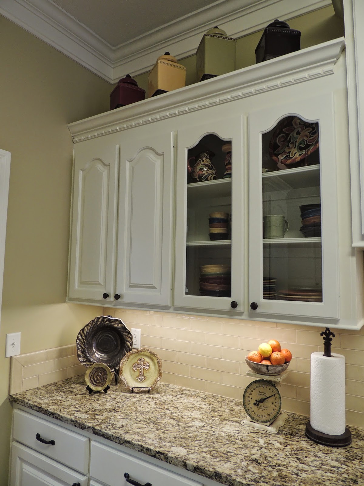
Today I am sharing our guest bathroom.  Technically, it is our son's bathroom, but it also serves as the bathroom for our guests.   The trick is to decorate it in a manner that is appropriate for a twelve year old boy, but also be nice and pretty for guests.  Mothers of boys, I am sure you understand what I am talking about!  If it were up to me, it would be prissy, but.... a twelve year old boy is a little bit like a bull in a china shop, so simple is best!  

Now, let's look at the before picture.  It was a "tropicana peach" color.  It was just not our taste at all.  The lady who previously owned our home is a dear lady, but our tastes could not be more different.


We were so happy when this room was painted.  It is now bright and crisp.   I wanted a light, airy color because the room does not receive any natural light during the day. 

The walls are now painted Rainwashed by Sherwin Williams.  All of the cabinets and trim throughout the house are Dover White, also by Sherwin Williams.  We also added crown molding to the room. 

The original counter top and sink were removed.  The new counter top is the same granite as our kitchen.  It is St. Cecilia.  There was enough left from one of the slabs used in our kitchen to make this counter top.  I was quite excited about that!!  It just makes the room!!

New fixtures in oil rubbed bronze add warmth to the room. 

A simple shower curtain was monogrammed to make it a bit more special!  
Who doesn't love a good monogram?

I have had these pictures for years and I still think they are terrific!  
These towels from Home Goods match perfectly!

We removed the mirror that was attached to the wall and replaced 
it with a simple framed mirror.  
McCarty birds blend perfectly with the colors of the room.  Another McCarty piece holds products that may be needed by a guest. 

We are so pleased with our new bathroom.  I think it is simple and quite pretty.  Keeping it that way, with a pre-teen son, now that is another story!!  

As always, thank you for visiting Buttercup Bliss!  

Sunday, February 15, 2015

Our Kitchen Renovation


Today I am finally sharing our new and improved kitchen.  First, you have to see the before pics to really understand where we are now.  I think I mentioned earlier that we fell in love with the location of our house.  The inside of the house left a lot to be desired.  You will see that the kitchen was just..... ugh!!  My husband just couldn't believe I truly wanted this house!!  I was willing to overlook a less than perfect house to be in a wonderful neighborhood, across the street from my father and around the corner from my sister.

Back to the kitchen.  It was a bright yellow with stark white cabinets, outdated fixtures, tile counter tops and dated black appliances.  The bar was the same height as the counter - too low for eating.  To put it bluntly, it was just not pretty!!  While we chose not to rip out all of the cabinets and start over, we did modify them to make them more interesting.  We added height to the area above the sink with an additional cabinet for increased storage.  We also removed the microwave and installed a vent hood.  There were six small drawers to the left of the stove.  It looked too cluttered to me, so we switched that out for a new cabinet that has three large drawers.  We had to modify this section anyway to fit our refrigerator. We also added a raised bar area to accommodate the bar stools we already had.

These are a couple of before pics: Needless to say, the light fixture and ceiling fan are long gone!

This view was looking from the dining area into the kitchen. I am so happy it no longer looks like this! 

I wish I had a picture of us tearing out the counter tops and back splash!  I never realized using a sledge hammer and a crow bar could be so fun!  It was a mess, but very satisfying!!

I am so happy with the way it turned out!  We painted the cabinets Dover White by Sherwin Williams. The walls are Ecru, also by SW. I would love to have switched out the upper cabinet doors to a much simpler style, but it just wasn't in the budget at this time. We changed all of the hardware to oil rubbed bronze for a warmer look.  The new drawer pulls add visual interest.  Previously, there were knobs on everything.  It looked too busy!! We added a new section of cabinets above the sink.  It is a perfect area for storing my cookbooks and serving pieces that are not used daily.   It is so much prettier than the open area in the "before" picture.

The counter tops are St. Cecilia granite.  My husband and I had a huge debate about the counter tops.  At first I wanted Cararra marble, but I honestly didn't think it was practical for us.  I really fell in love with Colonial Creme granite.  I saw it in a home in Delta magazine, and I thought it would be perfect.  However, Jon reminded me that over the last several years, when we looked at granite I always gravitated toward St. Cecilia....true!  The Colonial Cream is beautiful though - in a totally different way than St. Cecilia.  It is much lighter and "creamier". Jon felt, and I finally agreed with him, that the St. Cecilia would be warmer - especially when paired with the backsplash tile - than the Colonial Cream.  Plus, the Colonial Cream was much more expensive!!  In the end,  I am so happy with our choice! It think it is beautiful.  I love the thicker slab and the rounded corners!   
With the exception of the refrigerator, all of the appliances were replaced.  Although I really wanted double ovens, it just wasn't feasible, however, we did get a gas range and and a new hood.  I love them!   All appliances are Kitchen Aid (to match the refrigerator - yes, we are OCD like that!)  The lower cabinets to the left of the stove are new.   Wide, deep drawers are so much more functional than the six small drawers that were there previously.   

I love having the microwave tucked into what would have been a crowded little corner.  The microwave fits perfectly!  I am so glad we opted to have a true vented hood instead of the microwave over the gas range.  The area above the range hood was built to cover the exhaust.  Plus, it breaks up all the cabinets that were the exact same height.  The top of the cabinets provides a wonderful place for me to display some of my Longaberger basket collection. We also added additional molding under the existing crown molding.  The increased width adds much needed character to the room.

We opted for a porcelain tile with a crackled finish for the back splash. The tiles are by Walker Zanger - the Tuileries Collection - color Breton Beige. This was a hard choice too!  Our first purchase came in and it did not go well with the granite at all.  We ended up sending it back and going to different store and working with a designer who helped us pick out  something that went beautifully with the granite. I love the herringbone pattern we chose for the area behind the sink. It is such a pretty focal point.
We added bead board to the pack of the raised bar area.  It is the perfect place for a quick snack or for Seth to do his homework. 

This is the view looking from the bar area into the kitchen.  The two areas of glass front cabinets allow my collection of Ironstone to be displayed. Our everyday dishes are on the left of the sink.  They add a cheerful pop of color to the kitchen. We also added under-cabinet lighting throughout the kitchen to help "show off" the beautiful subway tile and the items being displayed on the counters.

A collection of Etta B pottery plates and bowls complement the color of the counter tops and back splash.  A vintage scale that my husband gave me for Christmas one year adds charm and is perfect for holding fruit.  

 Simple, clear canisters keep necessities close at hand. 


A small "Happy Everything" cookie jar is the perfect size for keeping utensils handy for cooking. 

So, there you have it!  Our "after" kitchen!!  We are very pleased with the results. It is functional, pretty, and practical. We put a lot of thought into where we could splurge and where we needed to rein in our "wants" - thus the absence of the Carrara marble,a farm sink, and double ovens.  I believe that by choosing classic materials with a timeless color scheme,we will be happy with our kitchen for years to come! 

Thanks for visiting Buttercup Bliss!